
Wednesday Style | To Match or Not to Match | Vancouver Child Photographer
Planning your wardrobe for a family session isn’t easy. Gone are the days when everyone shows up in matching kakhi pants and white shirts… and that makes it a little more difficult. :). For this week’s edition of Wednesday Style, I thought I’d share some different thoughts about matching and colour schemes. This can help you put different pieces in your closets together for a perfect family look.
Instead of trying to match the same color on every family member, why not put them all in colors that are either in the similar hues, complimentary, or no correspondence at all! Here are some examples:
Similar hues: Soft or dusty colors, vibrant colors, neutral colors
Complimentary: Colors that are opposite on the color wheel like blue-orange, red-green, purple-yellow
No Correspondence: This doesn’t mean have one kid in in their Sunday best and another in a swim suit, the idea is everyone should be dressed similar in style such as all dressy or all casual, but lots of color variation. This makes for fun photographs!
So with your next session, try to avoid the “everyone in a denim shirt” theme and choose either similar or complimentary colours. Chances are, you’ll love not matching.
Here are some great examples:
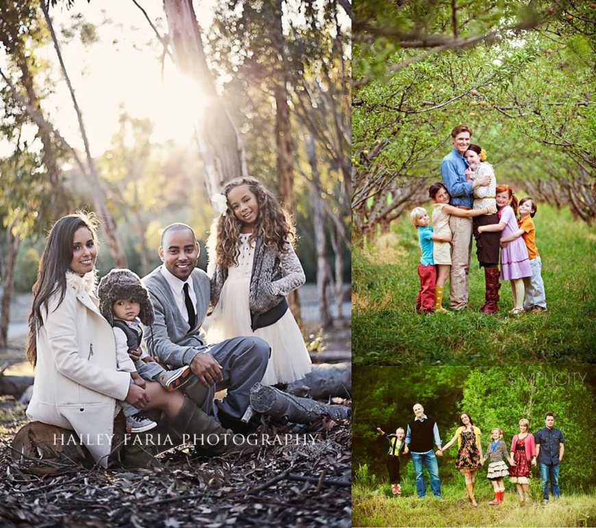

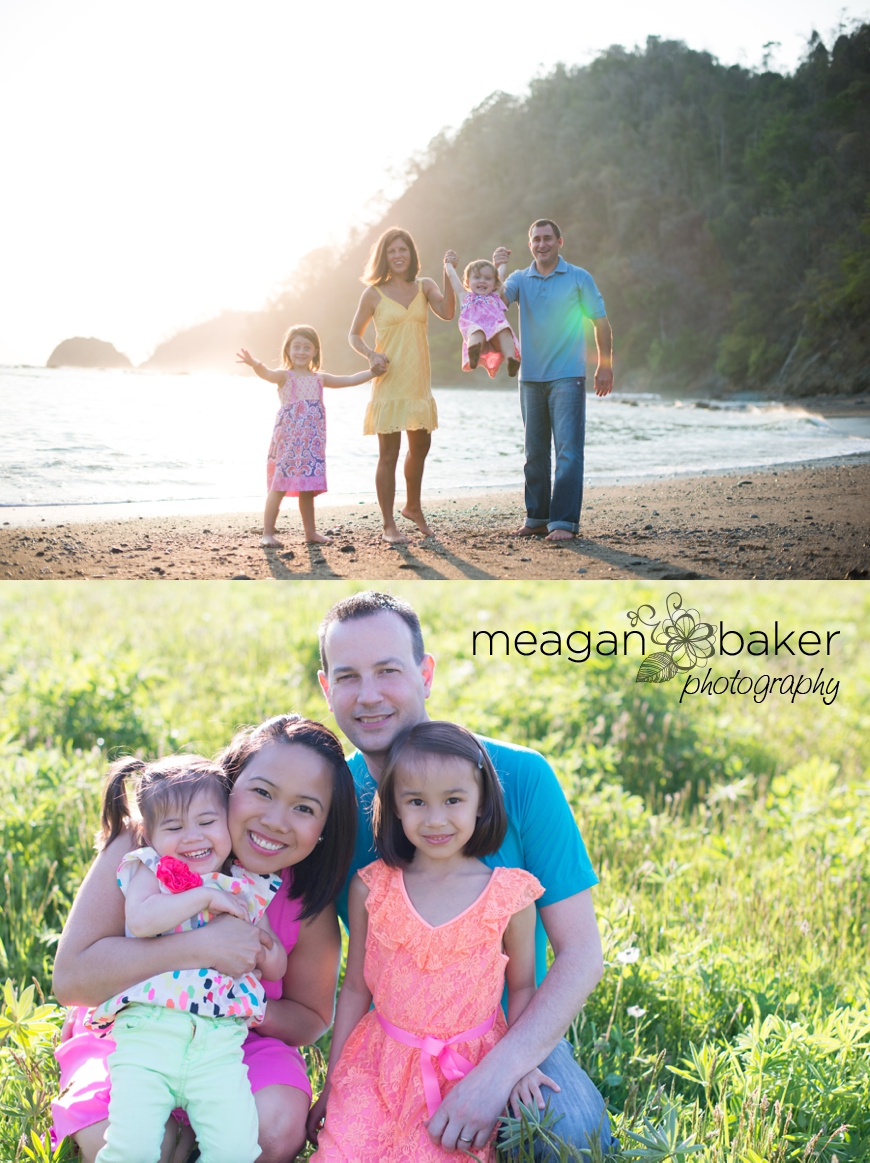
Image Source, from top to bottom, left to right.
– http://haileyfariablog.com/page/2/
– http://nieniedialogues.blogspot.jp/search?updated-max=2010-09-16T01:00:00-07:00&max-results=20
– http://simplicityphotography.com/blog/?p=1493
– http://elliegrover.com/blog/maxwell-family/

